PowerUp your PowApps with PCF Components
Early this year I discovered an announcement about PCF components for the Power Platform. What does this mean? Can I create own powerful components in TypeScript and React, import them into my PowerApps, and add new functionality? Can I perhaps even bypass limitations of standard controls?
This all sounds promising, and you know I’m incredibly curious. What more can I say, PCF Components have definitely peaked my interest!
As soon as I realized that this preview feature was available in our Office 365 Tenant, I started to create own PCF components to check out this technology. And yes … This was the beginning of a wonderful friendship.
PowerApps Component Framework
Microsoft’s definition says: “PCF enable PowerApps makers to include external professional developed controls into your model-driven or canvas apps.” In other words, my app is no longer limited by standard controls. 😛 [read more]

First of all, I am free to use special layouts for my control elements. With Cascading Style Sheets I am able to define color gradients, special fonts and much more.
Secondly I can use powerful web technologies and frameworks like Node.js, TypeScript and React. This allows me to also include Open Source libraries and components.
Another big advantage is. There are almost no restrictions in using the device features of my hardware. This means in detail, the camera resolution and quality, microphone, and GPS of my smartphone.
Finally this combination enables me to combine a lot of functionality with the advantages of my Power Platform. For instance, consider mobile mixed reality PowerApps with virtual agents and secure data access on your Common Data Service.
My Issue – I need a powerful Component
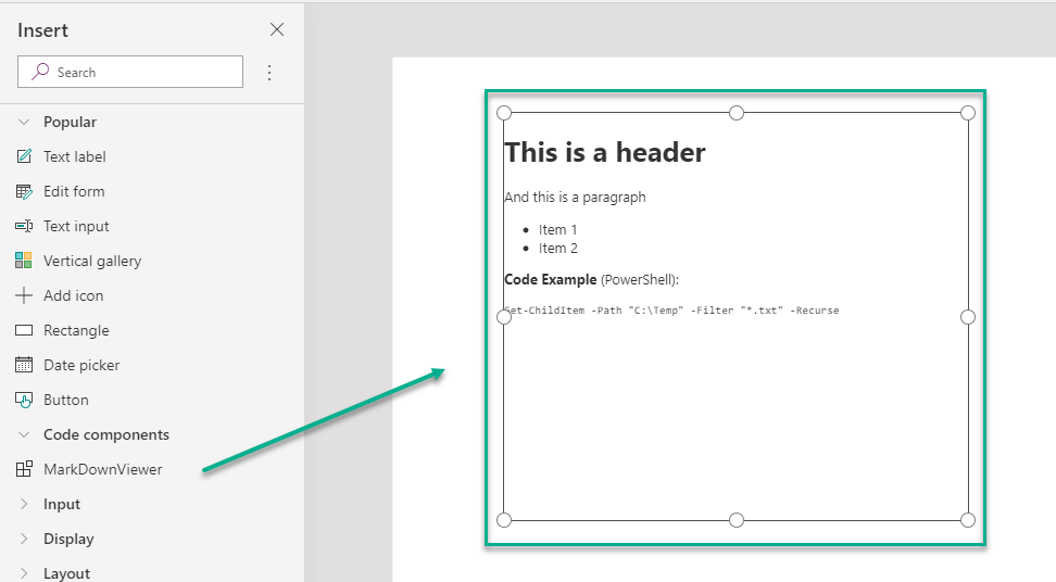
In one of my PowerApps I tried to include documentation files from a repository. These files uses the MarkDown language to format the content. I like this kind of documentation, because it is easy to write and you get a great functional documentation. To say it in other words, I want to include such content in my PowerApps with all the features like formatting and highlighted code snippets as follows:
Ok, PowerApps have the HTML control to display a layouted text, but this control can only render HTML code or snippets and there are limitations. Per example you can’t include JavaScript or CSS to use a special formatting and rendering for MarkDown.
… as soon as I discovered PCF, I found a solution for my issue 🙂
My Solution – PCF MarkDown Viewer
Yes, I create a MarkDown Viewer control for PowerApps to solve my issue! But where to start?
First of all I have read the documentation, watched some videos, and followed Microsoft’s tutorials. Pretty soon I discovered I need to prepare my development environment and install some prerequisites:
- PowerApps CLI
- Node.js
- MSBuild (e.g. from Visual Studio)
As next step it was time to setup the PCF component project. I navigated to an empty folder, followed the instructions, and started with the PowerApps CLI command:
pac pcf init --namespace MMe --name MarkDownViewer --template fieldAfterwards, I used npm to install needed libraries:
npm install
npm install react react-dom office-ui-fabric-react
npm install react-markdown
npm install @types/react --save-dev
As you can see, I have used some libraries to implement in my control. This is because I want to write less code and per example don’t reinvent the MarkDown rendering for my control. In detail, I have included following libraries:
Most parts of a PCF Control Project are auto generated. Per example you get a prepared Manifest (ControlManifest.Input.xml) as well as the your prepared PCF Standard Control (index.ts).
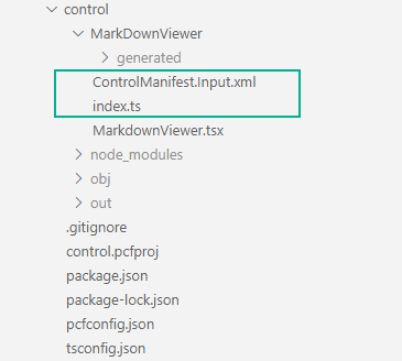
Manifest
I want to configure the visualized MarkDown content in the PowerApps Designer. Therefor, it’s time to define some properties for my PCF component.
This is done in the PCF Control Manifest file: ControlManifest.Input.xml. In short, the Manifest describe all metadata, properties, resources and used features of my control.
During implementation I realized I need following properties:
- a string Content to pass MarkDown content to my control
- an enum FontSize to change the size of the rendered text
- and finally an enum Overflow to manage the display of scrollbars
As result, my Manifest contains this 3 property definitions:
<?xml version="1.0" encoding="utf-8" ?>
<manifest>
  <control namespace="MMe" constructor="MarkDownViewer" version="0.1.3" display-name-key="MarkDownViewer" description-key="MarkDownViewer_Desc" control-type="standard">
    <!-- property node identifies a specific, configurable piece of data that the control expects from CDS -->
    <property name="Content" display-name-key="Content" description-key="Content_Desc" of-type="Multiple" usage="bound" required="true" />
    <property name="FontSize" display-name-key="Size" description-key="Size_Desc" of-type="Enum" usage="bound" required="true">
      <value name="Initial" display-name-key="Initial" description-key="Initial_Desc">initial</value>
      <value name="Smaller" display-name-key="Smaller" description-key="Smaller_Desc">smaller</value>
      <value name="Small" display-name-key="Small" description-key="Small_Desc">small</value>
      <value name="X-Small" display-name-key="XSmall" description-key="XSmall_Desc">x-small</value>
      <value name="XX-Small" display-name-key="XXSmall" description-key="XXSmall_Desc">xx-small</value>
      <value name="Medium" display-name-key="Medium" description-key="Medium_Desc">medium</value>
      <value name="Large" display-name-key="Large" description-key="Large_Desc">large</value>
      <value name="Larger" display-name-key="Larger" description-key="Larger_Desc">larger</value>
      <value name="X-Large" display-name-key="XLarge" description-key="XLarge_Desc">x-large</value>
      <value name="XX-Large" display-name-key="XXLarge" description-key="XXLarge_Desc">xx-large</value>
    </property>
    <property name="Overflow" display-name-key="Overflow" description-key="Overflow_Desc" of-type="Enum" usage="bound" required="true">
      <value name="Auto" display-name-key="Auto" description-key="Auto_Desc">auto</value>
      <value name="Scroll" display-name-key="Scroll" description-key="Scroll_Desc">scroll</value>
    </property>

    <!-- ... -->
  </control>
</manifest>
Note: When you change per example the property names, you need to rebuild and re-generation the TypeScript types or you get some errors.
TypeScript & React Component
To use my properties I have setup the interface IMarkdownViewerProps in React file MarkdownViewer.tsx. As you can see, I added also some properties to adjust the size of my control:
export interface IMarkdownViewerProps {
    content?:   string | undefined
    fontSize?:  string | undefined
    overflow?:  string | undefined
    maxHeight?: string | undefined
    maxWidth?:  string | undefined
}
My component MarkdownViewer (“MarkdownViewer.tsx”) uses the properties described by the interface to display the content. Additionally, I adjusted the css style of the control to customize the rendering of my component.
export default class MarkdownViewer extends React.Component<IMarkdownViewerProps> {
    content?: string | undefined
    public render() {

        return (
            <div style={{
                overflow:  this.props.overflow  || "auto",
                textAlign: "left",
                fontSize:  this.props.fontSize  || "initial",
                height:    this.props.maxHeight || "initial",
                width:     this.props.maxWidth  || "initial",
                maxHeight: this.props.maxHeight || "none",
                maxWidth:  this.props.maxWidth  || "none"
                }}>
                <ReactMarkdown source={this.props.content || ''} />
            </div>
        );
    }
}
PCF Standard Control
The main entry point for my component is my class MarkDownViewer in file index.ts:
export class MarkDownViewer implements ComponentFramework.StandardControl<IInputs, IOutputs> {
   /* ... */
}
The TypeScript file index.ts was introduced by declaration as resource in my PCF manifest. As you can see in my code snippet, I can also add other content like Cascading Style Sheets (CSS) and language resources:
<?xml version="1.0" encoding="utf-8" ?>
<manifest>
    <!-- ... -->
    <resources>
      <code path="index.ts" order="1"/>
      <!-- UNCOMMENT TO ADD MORE RESOURCES
      <css path="css/MarkDownViewer.css" order="1" />
      <resx path="strings/MarkDownViewer.1033.resx" version="1.0.0" />
      -->
    </resources>
    <!-- ... -->
  </control>
</manifest>
The component framework StandardControl (base class of my class MarkDownViewer) need 2 interfaces: IInput and IOutput.
Both are auto generated from content of the manifest. Therefor IInput and IOutput and describe all input and output properties for my PowerApp:
// Define IInputs and IOutputs Type. They should match with ControlManifest.
export interface IInputs {
    Content: ComponentFramework.PropertyTypes.StringProperty;
    FontSize: ComponentFramework.PropertyTypes.EnumProperty<"initial" | "smaller" | "small" | "x-small" | "xx-small" | "medium" | "large" | "larger" | "x-large" | "xx-large">;
    Overflow: ComponentFramework.PropertyTypes.EnumProperty<"auto" | "scroll">;
}
export interface IOutputs {
    Content?: string;
    FontSize?: string;
    Overflow?: string;
}
Furthermore my class MarkDownViewer have to implement some methods:
- init to initialize the control the first time
- updateView is called every time, when a property is changed from PowerApp. This is the place, where I get values from IInput and render my control.
- getOutputs on the other hand provide changes from my control to the PowerApp and its components.
- destroy is finally used to clean up resources.
Initialize the Control
First of all, my control need two class variables. Variable “mContainer” references the HTML DIV element needed for rendering and variable “props” store my control data.
export class MarkDownViewer implements ComponentFramework.StandardControl<IInputs, IOutputs> {

	private mContainer: HTMLDivElement;
	private props: IMarkdownViewerProps = {
		content:  "# Initial Content",
		fontSize: "Initial",
		overflow: "Auto"
	}

}
My variables are initialized in init(…) as follows:
public init(context: ComponentFramework.Context<IInputs>, notifyOutputChanged: () => void, state: ComponentFramework.Dictionary, container:HTMLDivElement)
{
	this.mContainer = container;
	context.mode.trackContainerResize(true);

	this.props.content  = context.parameters.Content.raw  || this.props.content;
	this.props.fontSize = context.parameters.FontSize.raw || this.props.fontSize;
	this.props.overflow = context.parameters.Overflow.raw || this.props.overflow;
}
Render the Control
I have already explained that updateView(…) is responsible for updating my control properties with data from PowerApps and rendering the control content. In other words, this function do the whole “Magic”.
First, my control updates its property information. PowerApps exposes data using the context parameter defined on the generated IInput interface:
/**
 * Called when any value in the property bag has changed. This includes field values, data-sets, global values such as container height and width, offline status, control metadata values such as label, visible, etc.
 * @param context The entire property bag available to control via Context Object; It contains values as set up by the customizer mapped to names defined in the manifest, as well as utility functions
 */
public updateView(context: ComponentFramework.Context<IInputs>): void
{
	// Add code to update control view
	this.props.content   = context.parameters.Content.raw  || this.props.content;
	this.props.fontSize  = context.parameters.FontSize.raw || this.props.fontSize;
	this.props.overflow  = context.parameters.Overflow.raw || this.props.overflow;

	/* ... */
}
Additionally I collect the allocated height and width. This is because, I want to render my control at the size I specify in the PowerApps Designer.
public updateView(context: ComponentFramework.Context<IInputs>): void
{
	/* ... */

	try {
		this.props.maxHeight = context.mode.allocatedHeight > 0 ? context.mode.allocatedHeight + "px" : undefined;
		this.props.maxWidth  = context.mode.allocatedWidth  > 0 ? context.mode.allocatedWidth + "px"  : undefined;
	} catch (e) { this.props.content = e }

	/* ... */
}
Finally, I use React to render my React component and pass my collected properties to my MarkdownViewer.
public updateView(context: ComponentFramework.Context<IInputs>): void
{
	/* ... */

	// Render the REACT MarkdownViewer with the actual properties
	ReactDOM.render(
		React.createElement(
			MarkdownViewer, this.props
		),
		this.mContainer
	);
}
Clean Up resources
Finally I unmount my react component in destroy(…) from the HTML DIV-element:
public destroy(): void
{
	ReactDOM.unmountComponentAtNode(this.mContainer);
}
My Result – PCF Control
After doing a little bit of TypeScript and React magic, I want to see my created component in my app. Therefor, it it’s time to package the PCF component in a solution and import this solution into PowerApps.
I followed these steps:
- Package my code component
- Connect to my PowerApps environment
- Deploy my solution to my environment
- Import and add my component to my canvas app
To shorten the story a little bit, as result my component was available in PowerApps and ready to use. And finally, I can embed well-formatted MarkDown content in my apps:
Conclusion
I have showed you in my example how you I improved my PowerApp with non-standard functionality. In detail I have created a PCF Component to render MarkDown content in my app.
I also explained in my example how-to setup a PCF Component and how-to use existing libraries like React. You’ve seen that even with programming, it is possible to add amazing functionality to PowerApps without writing much code.
Summarized PCF Component Framework means for me:
Almost unlimited possibilities for PowerApps
#LessCodeMorePower
Finally, my source code (PCF component and solution) is Open Source and shared on my GitHub repository: https://github.com/megel/PCF-MarkDownViewer
Feel free to use this component in your apps. Please share your experiences, improvements and suggestions as comments!
You can also find my MarkDown Viewer here at PCF Gallery. I recommend you to visit this page to be inspired by many other controls with cool functionality for your PowerApps!
… Happy Sharing and don’t forget #NeverStopLearning