
Write Less Code – Create reusable Components!
Component development is not a big deal for me as a Pro-Developer. On the other hand, I recognized during my session at PowerApps Developer Bootcamp our citizen developers need help and examples. For that reason I want to share one example presented in my session.
To cut a long story short: Write less code by creating reusable components! The reason is obvious: During development, we generate lots of copy & paste content in our canvas apps. And yes, I also use copy & paste during rapid development.
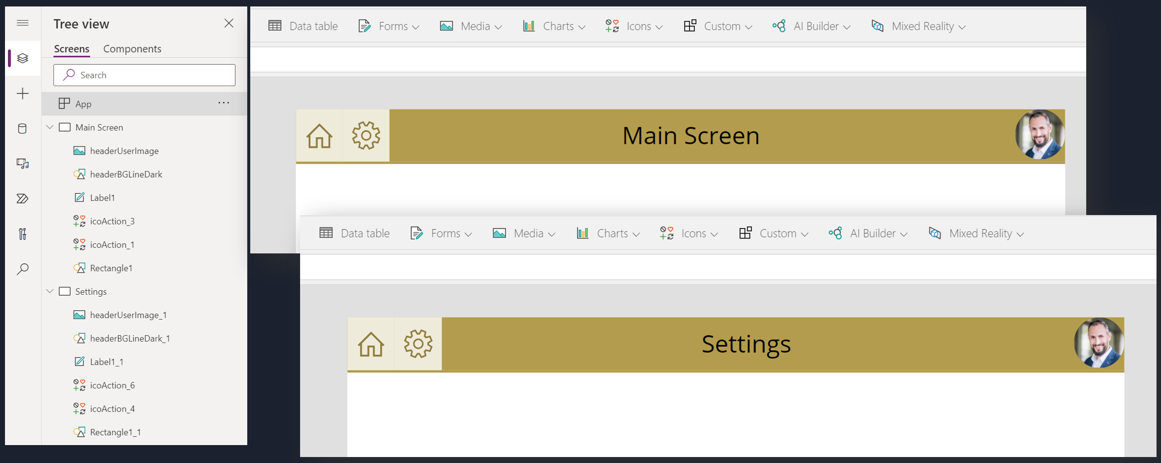
That’s fine if you clean up when you get a chance. Start refactoring after discovering such duplicity in controls and code. Here is my example of 2 screens the with header copy & pasted control for the header in each screen:
Here is what I do to clean up my canvas app and build a reusable header control.
1 – 2 – 3 Refactoring!
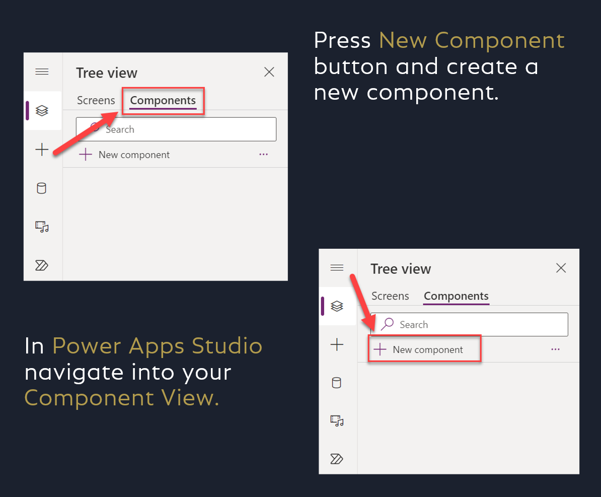
At the beginning, I create a new custom component in my canvas app. I follow these steps:
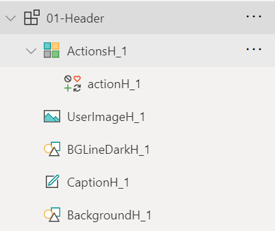
Now it’s time to copy my header controls from one of my screens into my custom component. Afterwards, I arrange my pasted controls. Furthermore, I adjust some formulas to align correctly. This is because, I want to resize my component later in my screens.

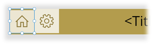
Additionally, I replace my navigation buttons by a gallery with a single button for each item. My component tree of my header control look as follows:
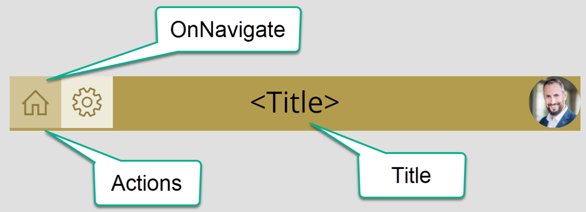
My layout is ready to use! Now I need to add properties.
Add Custom Properties
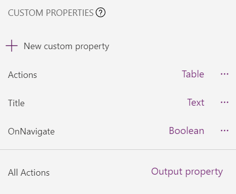
My goal is to configure my custom component in my screens. For this I need the following properties:
- Title as Input Property of type Text
- Actions as Input Property of type Table
- OnNavigate as Behavior Property of type Boolean with a Parameter item of type Record to handle the OnSelect event of my button
Additionally, I will add also a property for my added gallery and use it in my galleries Data property. This is because, I want to define a filter for my Actions. In conclusion, I add:
- All Actions as Output Property of type Table
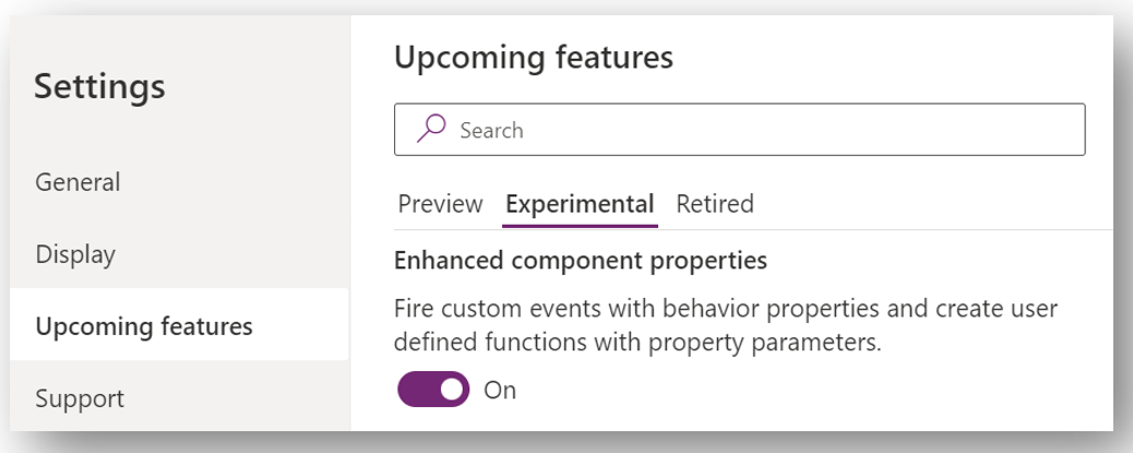
Prerequisites
Still important is to activate Enhanced component properties, to work with behavior properties and parameters. I do this in my canvas app settings:
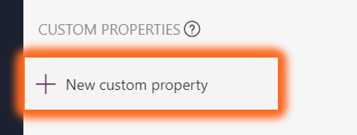
Define Properties
Now I select my custom component and navigate to its properties. Here I use “New custom property” to create a new custom property:
As result a dialog opens and I can setup my new custom properties:

A few minutes later, my added properties are ready. The result looks like this:
Here is also my used PowerFX code:
Title: "<Title>"

Actions: |-
    =Table(
        {name:"Home",     icon:Icon.Home,     visible: true, screen: App.ActiveScreen },
        {name:"Settings", icon:Icon.Settings, visible: true, screen: Blank() }
    )

AllActions: |-
    =Filter(Self.Actions, visible)

OnNavigate(item As Record):
    item:
        Default: |-
            =First(Self.AllActions)
    ThisProperty:
        Default: =true
Button – OnSelect and OnNavigate
Remember, I have added a parameter item to my OnNavigate behavioral property. This is because I want to give the consumer of my trigger some context information. In detail: Which button / action was selected.
Furthermore, I use the return value of my OnNavigate behavioral property. When my result of the call is False, I avoid the navigation. Otherwise, I allow the navigation to the selected screen. Therefore, I have used the If(…) statement in the OnClick trigger of my button:

Here is an example, where I return True when my item.scrren screen is my ‘Main Screen’. As result I navigate to the ‘Main Screen’. Well, that’s not so stunning, but try it yourself…

Header Component in Action
Using my component in screens is simple. I add in each screen my new header component and replace the existing header controls:
Additionally, I have defined a collection Actions, that I use for property Actions in each of my Header controls:
ClearCollect(Actions, Table(
    {name:"Home",       icon:Icon.Home,     visible: true, screen: 'Main Screen' },
    {name:"Data Entry", icon:Icon.Edit,     visible: true, screen: 'Data Entry' },
    {name:"Settings",   icon:Icon.Settings, visible: true, screen: Settings }
));
Therefore all my header controls have the same information.
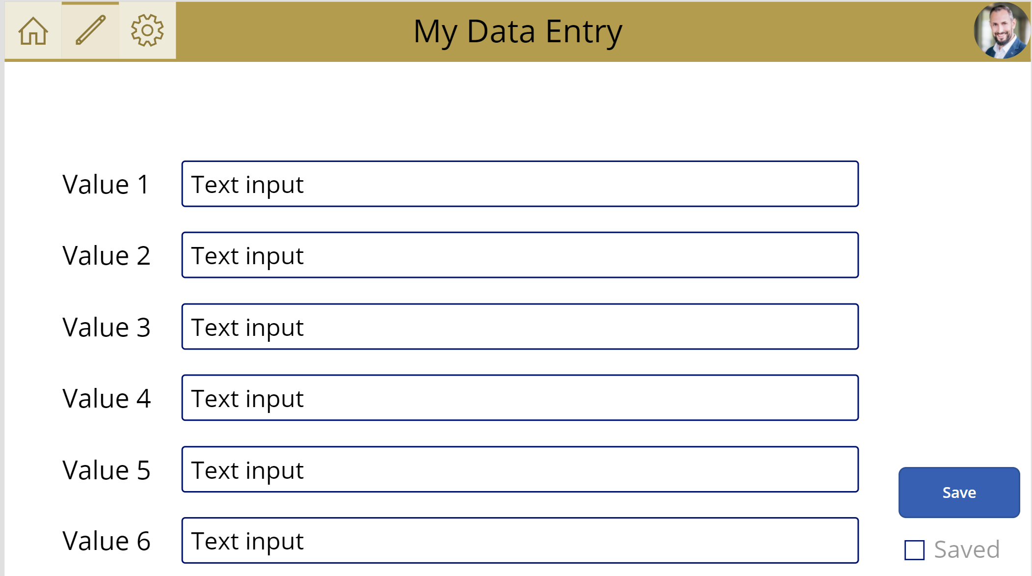
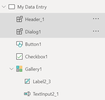
I also created a Data Entry Screen in my example with some Textboxes to enter data:
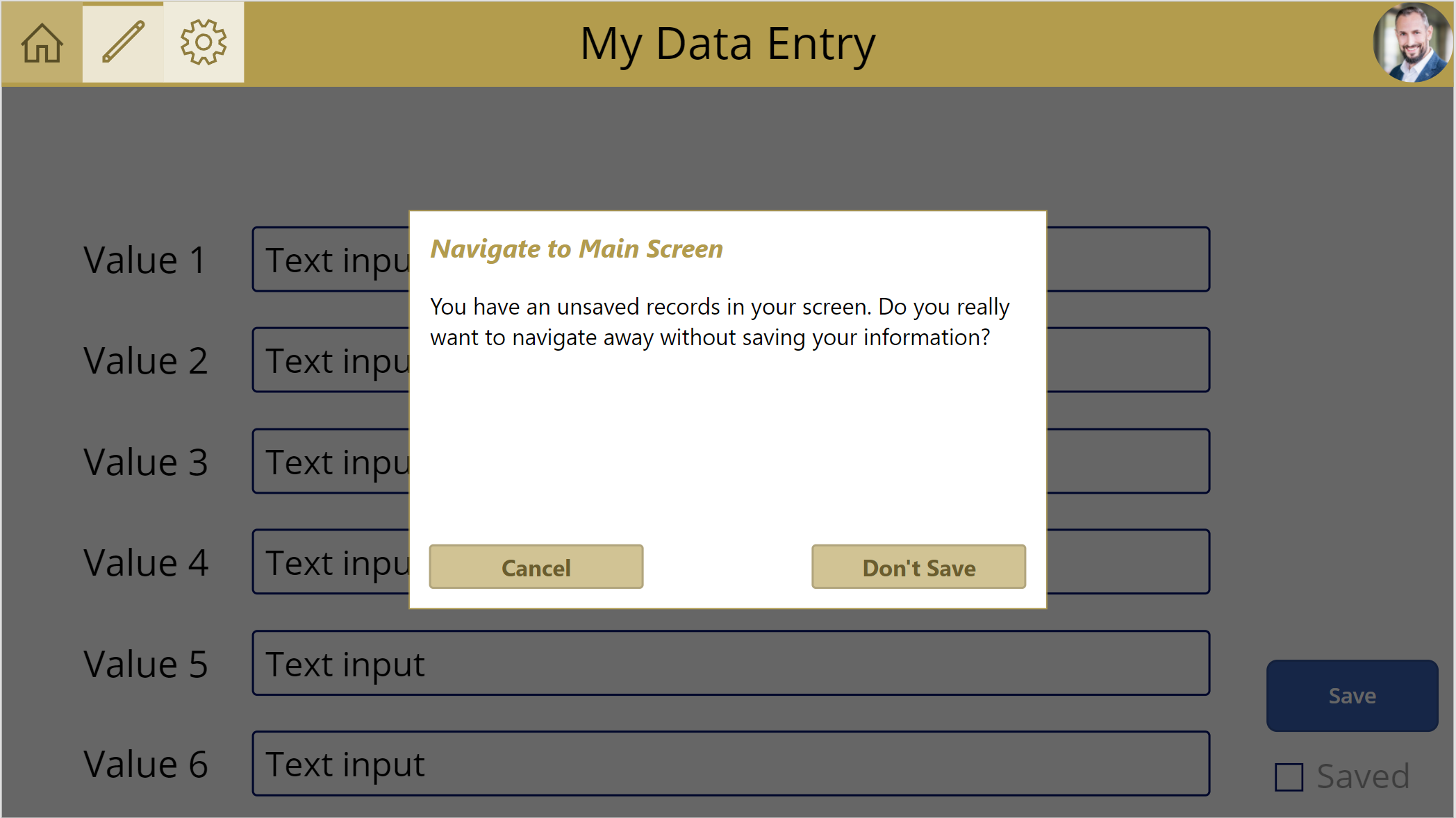
As navigation example, I will return false for OnNavigate, when my data is changed but not saved. In this case, I’ll show a dialog – well another component – and let my user decide what to do…
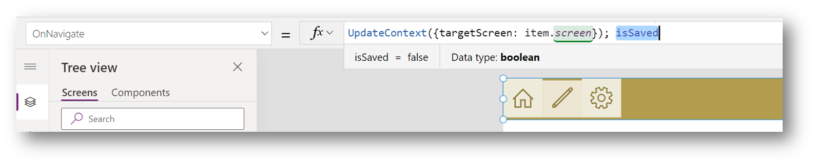
The magic behind is included in my OnNavigate trigger. My dialog shows up, when my variable “targetScreen” isn’t my current screen. For this I use UpdateContext(…). Furthermore, I cancel navigation by returning the value of isSaved. This is because isSaved is the last expression in my formula.
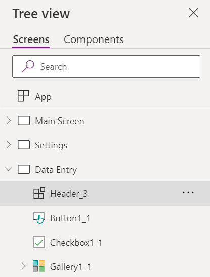
In detail, I use 2 components in one screen for all this logic and functionality. Perfect, my component tree have only this few controls:
Refactoring accomplished!
Summary
You have seen in my example it isn’t so hard to refactor a canvas app. I have created a new custom component for my previously copy & pasted header controls. Furthermore, I defined a couple of custom properties in my custom component. Finally, I replaced all header controls in screens by my header component.
What should I say, you see creating custom components is not only made for Pro-Developer. You can do this in your own canvas apps. Start refactoring! … Write Less Code by building reusable components!